Katsushika Hokusai 葛飾北斎, Ryakuga hayaoshie 略画早指南, 1812-1814

Artist: Katsushika Hokusai 葛飾北斎  (1760-1849)

Title: Ryakuga hayaoshie 略画早指南

Date of Publication: 1812 for volume 1, 1814 for volume 2. Publisher: Unspecified.

Medium: Woodblock printed, ink on paper

Dimensions: Chūbon: 18.6 x 13.1 x 0.7 cm

Gift of Arthur Tress

Kislak Center for Special Collections – Arthur Tress Collection. Box 16, Item 10.

See digital images here

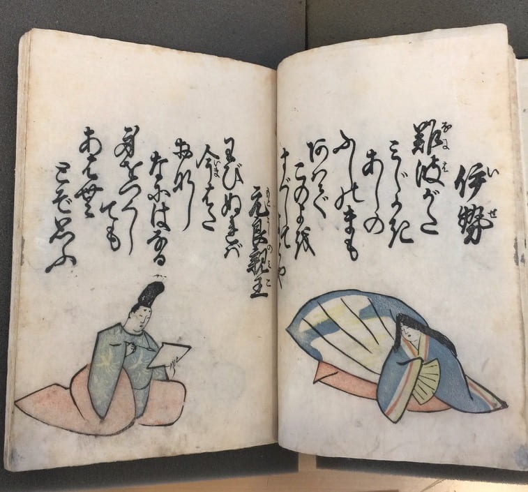
Hokusai designed this book, Ryakuga hayaoshie, as a drawing instruction manual. It was printed in three volumes and in each Hokusai demonstrates principles of design. The Tress Collection includes two volumes from the set. In volume 1, Hokusai breaks the drawings down into simple geometric shapes. Volume 2 focuses on the contours of the drawing and characters. By looking at other collections, we can see that in volume 3, Hokusai diagrams the line strokes and order of making them (see for example, the copy held in the Pulverer collection). The Tress copy was part of an important French collection assembled in the 1880s by E. Gillet. In addition to rebinding the books, Gillet may have also written the extensive notes in French that appear in the back of the second volume, as well as added floral interior and exterior patterns to the books front and back covers.

In Ryakuga hayaoshie, or Quick Lessons in Simplified Drawing, Hokusai intended to teach drawing methods to a varied audience. This genre of book was inspired by Chinese models that presented techniques for creating paintings by building on simple to complex forms using simple brushstrokes.

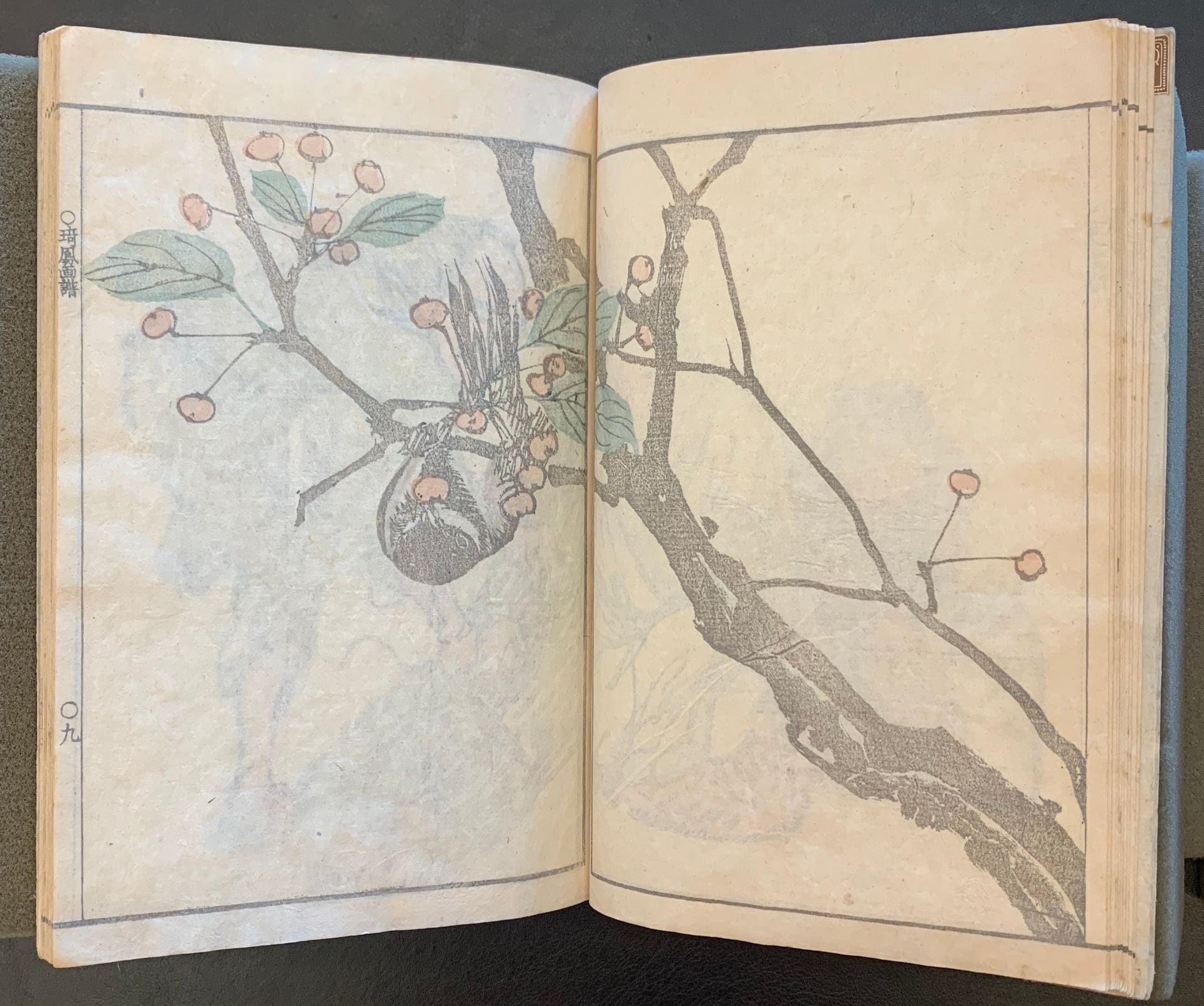
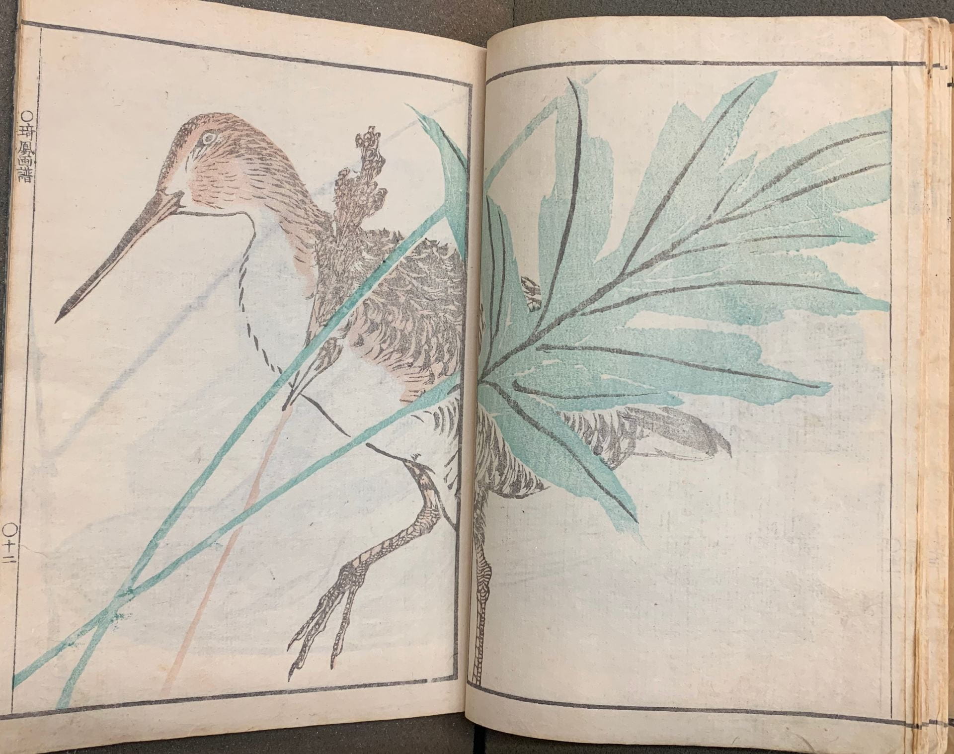
The theme of Hokusai’s first volume is to use shapes and forms to show how to break down complex renderings. As we can see in the illustration from volume one, Hokusai explores a few foundational drawing concepts through beautiful renderings of three animals, in various stages of finished images. Corresponding to the fully rendered drawing of each animal, on the opposite page there is instruction on how to construct the finished rendered form. For example, in the bottom right corner Hokusai shows a finished rendering of an animal, which appears to be some form of bull or yak, and then on the opposite page breaks down the animal’s construction into its simple geometric shapes. These shapes consist of circles, a triangle, and linear lines. These lines act as a basic contour, gesture, and the form of the figure and the geometry that the shape and line represent. It has been reported that Hokusai believed that anything could be rendered from simple shapes. In the top left corner, Hokusai shows how to render animal hair. By following the shape of a circle Hokusai skillfully uses a brush to draw hairlines on the contour of the circular shape. Looking back to the drawing in the bottom right corner (the bull/yak), the shapes are no longer visible and there is more gesture in the illustration, yet the original geometric forms are still evident given the hair in the middle of the drawing creates a circular shape. In addition to this, the top back of the animal shows a circular line, clearly visible through the gesture of hair. We can see the line even though it is not drawn in.

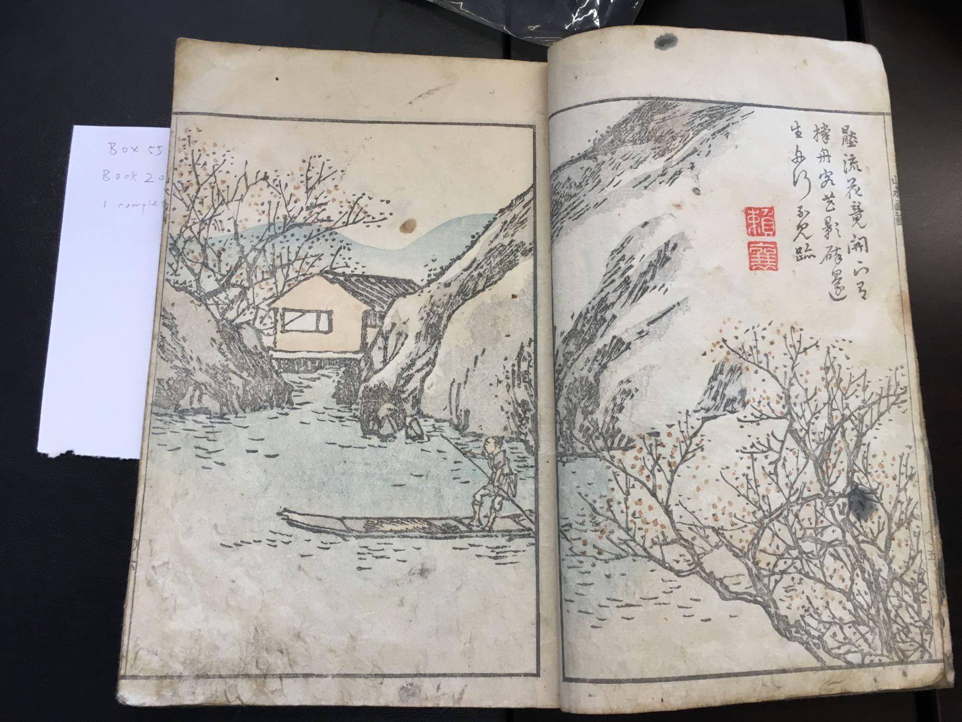
In the second volume, Hokusai uses the theme of Japanese  characters as a structure for his drawing, as a method to build gesture and contour line drawing. For example, in the illustration shown here, Hokusai shows renderings of landscapes. Like Volume One, where Hokusai breaks down a drawing from fully rendered form to simple geometric shapes, here he uses a similar method of simplification in explaining how to draw the forms. For example, the landscape shows a hillside, trees, and small man-made structures. Above this landscape, the contour lines in the calligraphy act as the structure of the drawing. Upon further inspection when looking at the fully rendered form any reader can clearly see the calligraphy taking shape of the hills, the tree, and the small structures. Hokusai gave the reader many tools to approach a drawing. Finally, on later pages in the book, Hokusai also teaches the reader how to hold and make lines with a brush. The brush is an extension of the artist and must also be taken into consideration as an area of study.

Also see the commentary for the book here: http://pulverer.si.edu/node/314/title/1

Posted by Derek Rodenbeck

April 15th, 2020

Kawamura Bunpō 河村文鳳, Bunpō sansui gafu文鳳山水画譜 1824

Artist: Kawamura Bunpō 河村文鳳 (1779 – 1821)

Title: 文鳳山水画譜 (Bunpō’s album of landscape paintings)

Date: Bunsei 7 (1824)

Medium: Woodblock print; ink and color on paper; paper cover.

Gift of Arthur Tress, Arthur Tress Collection Box 55, Item 20 (https://franklin.library.upenn.edu/catalog/FRANKLIN_9977502846003681)

Kawamura Bunpō 河村文鳳 (1779-1821) was a Japanese landscape painter of the late Edo Period, born in Yamashiro Province, in modern day Kyoto Prefecture. He was best known for his illustrations of Chinese style landscapes (sansui), as can be seen in other published works such as Bunpō gafu (1807). He was a student of the artist Ganku 岸駒 (1756-1839) According to a postscript in the book by Bunpō’s student Kawamura Kihō (1778–1852) Bunpō sansui gafu was compiled at the request of Bunpō’s publisher Yoshidaya Shinbē.[1] The work, which consists of thirty pages of landscapes of Chinese settings, also includes quotidian scenes of daily work and life as well as poems by the poet Rai San’yō. Fellow artist Tanomura Chikuden once praised Bunpō’s fluid lines and ability to draw human figures, while his landscape paintings are known for their use of heavy brush strokes and thick contours.

Bunpō sansui gafu shows a variety of Chinese landscape paintings, and the renderings of his brush lines to provide contour and depth is striking. Human figures are generally marginal or de-emphasized in the composition; when they do it appear, it is usually figures at work, leading horses or ox, riding down rivers on boats, or simply walking in pairs or alone down winding paths or snowy landscapes. Both summer and winter are depicted in the series, and scenes of towns covered in snow exemplify Bunpō’s dramatic use of dark contours and color. These elements are particularly notable in the British Museum’s copy of the work, which preserves the striking color contrasts and sharp lines characteristic of the art.

Ellis Tinios links Bunpō’s interest in a variety of styles of art, particularly Chinese style painting, to the artistic and literary conventions of early nineteenth-century Kyoto, in which a variety of influences were available. According to him, Bunpō was himself perceived as an unusually eclectic artist, with an 1850 account stating that “took from all schools to develop his own unique style.”[2] He had a wide variety of associates, including the writer Ueda Akinari (1734-1809) and the Confucian scholar and poet Rai San’yō (1780-1831). Alongside his landscape, Bunpō was known for his artistic compositions that were didactic in intent (gafu) and for readers interested in painting and composition. While Bunpō is not as well known today as similar landscape artists of his period, his versatility in a wide variety of artistic genres and styles and ability to move between different conventions can still be seen in his work.

Other information on this copy: The book has information possibly identifying the previous owner that says “Mikawa Province, Hazu-gun, Nishio Han, Tokuda Jirō, Dental Specialist” (三河幡豆郡西尾藩 徳田次郎歯専).


Citations

Ellis Tinios. Kawamura Bumpō: Artist of Two Worlds. Leeds, U.K: University Gallery Leeds, 2004.

Kobayashi Tadashi and Jun’ichi Ōkubo 小林忠 大久保純一. Ukiyo-e no kansh kihon chishiki 浮世     絵の鑑賞基礎知識[The fundamentals of appreciating Ukiyo-E] Tokyo: Shibundo, 1994.

Other Collections  

Pulverer Collection. Bunpō sansui gafu 文鳳山水画譜, Accession no. FSC-GR-780.284, https://pulverer.si.edu/node/421/title/1

Metropolitan Museum of Art. Bunpō sansui gafu 文鳳山水画譜, Accession no. 2013.662, https://www.metmuseum.org/art/collection/search/78583?searchField=All&sortBy=Relevance&ft=Kawamura+Bunp%c5%8d&offset=0&rpp=20&pos=1

British Museum of Art Bunpō sansui gafu 文鳳山水画譜, no. 1959,0509,0.6.2 https://www.britishmuseum.org/collection/object/A_1959-0509-0-6-2

[1] Ellis Tinios. Bunpō sansui gafu 文鳳山水画譜, FSC-GR-780.284 https://pulverer.si.edu/node/421/title/1

[2] Ellis Tinios. Kawamura Bumpō: Artist of Two Worlds. (Leeds UK: University Gallery Leeds, 2004): 10.

Posted by Patrick Carland

Kawamura Bunpō 河村文鳳 , Kinpaen gafu 金波園画譜 1820

Artist: Kawamura Bunpō 河村文鳳 (1779 – 1821)

Title: Kinpaen gafu 金波園画譜; Picture Album by Kimpaen

Date: 1820

Medium: Woodblock printed; ink and color illustrations on paper; paper covers

Publisher: Hishiya Magobē 菱屋孫兵衛

Gift of: Arthur Tress Collection. Box 8, Item 5; Arthur Tress Collection Box 62, Item 14
https://franklin.library.upenn.edu/catalog/FRANKLIN_9977502569803681#franklin-availability
https://franklin.library.upenn.edu/catalog/FRANKLIN_9977502838903681#franklin-availability

These are fine first edition copies of Kawamura Bunpō’s Kinpaen gafu, or “Kinpaen’s album of paintings,” in the genre of Chinese painting known as kachōga, or bird-and-flower-paintings.  Although this style of bird-and-flower painting originated in China in the tenth-century, Bunpō’s style in particular stems from the Chinese Jiezhiyuan hua zhuan 芥子園畫傳, or the Manual of the Mustard Seed Garden, printed during the early years of the Qing Dynasty in the seventeenth-century. The painting manual became well known throughout Japan during the Edo period, with the earliest illustrated woodblock copy published in Kyoto in 1748.  The publisher of these two volumes in the Kress Collection, Hishiya Magobē (Gosharō), “advertised Bunpō’s Kinpaen gafu alongside his own fine edition of Jiezhiyuan hua zhuan” along with “other titles relating to Chinese art and culture.”

Bunpō imitates the Chinese method of omitting the outlines of leaves and stems known as Mogu 沒骨, or the “boneless technique,” which relies instead on forms produced by the colors themselves, as opposed to dark, heavy outlines used in drawing.  As scholar Ellis Tinios has noted, “there are also many instances in which delicate colors subtly blend one into the other,” and “the play of the artist’s brush is rendered as more tightly controlled.”  These details are all the more impressive given that these editions of Bunpō’s albums were woodblock printed books that succeed in beautifully reproducing a color application technique associated with elite forms of Chinese painting.

Kinpaen gafu is the only one of Bunpō’s many album books that was printed using a wide array of light colors.  In both Tress Collection volumes, varying shades of yellow, green, pink, and red appear in abundance and are applied to Japanese mulberry paper. However, the chief remarkable difference between the two volumes lies in their overall application of the pigments themselves as they appear in each print. While the volume on the left features a heavier application of color which results in darker illustrations, the colors of the volume on the right are much more muted. Their printed application appears more delicate, as though the printing was performed with less ink, resulting in lighter washes of color which give the impression of a more understated palette of pigments. While Bunpō’s album was meant to instruct the aspiring painter in rendering sights and scenes from the natural world, these books could have been used to instruct the printer’s apprentice in the art of the application of color when printing with a woodblock.

Bunpō’s preface to the work is written in Chinese characters. In it, Bunpō “states that it does not matter whether the artist is Chinese or Japanese.”  Instead, “what is important is that the artist’s work possesses depth of feeling, skill in handling the material, and the ability to depict the essence of things.”  The same could be said regarding these beautifully colored prints: what is most important is not the “higher” art of painting or the “lower” art of print, but rather, the effects they produce in the eyes of the viewer.

Posted by Judith Weston

November 20, 2019

Kawamura Kihō 河村琦鳳, Kihō gafu 琦鳳画譜, 1826-1827

Impression 8. 15, No. 19 (Figure 1)

Artist: Kawamura Kihō 河村琦鳳 (1778-1852)

Title Kihō’s Picture Album

Date: after 1826 (Bunsei 9)

Medium: Woodblock printed; ink and color on paper

Dimension: 25.9 x 17.8 x 1.1 cm

Publisher: Yoshida Shinbē 吉田新兵衛 (Bunchōdō 文徴堂)

Arthur Tress Collection, Box 8, Item 15

See digital images

https://franklin.library.upenn.edu/catalog/FRANKLIN_9977502575803681#franklin-availability


Impression 8.7, No. 31

Artist: Kawamura Kihō 河村琦鳳 (1778-1852)

Title Kihō’s Picture Album

Date: 1827 (Bunsei 10)

Medium: Woodblock printed; ink and color on paper

Dimension: 25.9 x 17.8 x 1.1 cm

Publisher: Yoshida Shinbē 吉田新兵衛  (Bunchōdō 文徴堂)

Arthur Tress Collection, Box 8, Item 7

https://franklin.library.upenn.edu/catalog/FRANKLIN_9977502569003681#franklin-availability


Impression 28.22, No. 12

Artist: Kawamura Kihō河村琦鳳 (1778-1852)

TitleKihō’s Picture Album

Date: after 1826 (Bunsei 9)

Medium: Woodblock printed; ink and color on paper

Dimension: 25.9 x 17.8 x 1.1 cm

Publisher: Yoshida Shinbē 吉田新兵衛 (Bunchōdō 文徴堂)

Arthur Tress Collection, Box 28, Item 22

https://franklin.library.upenn.edu/catalog/FRANKLIN_9977502739203681#franklin-availability


Kihō gafu, a picture album by Kawamura Kihō, contains 30 double-page illustrations of flowers, animals, rural landscapes, and human figures in everyday life scenes. Human figures are shown enjoying bucolic tranquility and revealing a free spirit. Subjects are depicted with ink lines in a calligraphic manner and embellished with lucid pale colors, evoking a Chinese painting style. In some illustrations, the artist abandoned the color-filling technique but applied colors directly to define the shape of the subjects, offering a painterly effect. Kihō gafu also features many inventive compositions, in which the single sheets not only stand as independent scenes but also can be unified as compelling double-page illustrations. In one opening, for example, a bough ascends from the right bottom corner in a diagonal way and traverses the central division into the opposite sheet, in which a little bird is shown hanging itself down from a branch and pecking the red fruits (fig. 1). The bough, rendered with powerful brushwork, is printed so skillfully that it looks like an ink painting, and the little bird is depicted in a delicate manner, balancing the boldness of the bough as well as its visual weight.

Kyoto-based artist Kawamura Kihō was the adopted son of Kawamura Bunpō. Kihō followed in the style of his teacher, Bunpō, adopting his distinctive approach to Chinese literati painting. Many of Kihō’s illustrations thus echo Bunpō’s designs. Kihō gafu was published by Yoshida Shinbē from his shop, the Bunchōdō文徴堂, located in Kyoto. The three titles in the Tress collection include different dates in the prefaces, postscripts, and colophons, demonstrating that these titles were produced over several years.  For example, in book 8.7, the preface includes a date of Bunsei 7 (1824), the postscript is dated Bunsei 9 (1826), and the colophon to Bunsei 10 (1827); thus, the earliest date we can give to this printing is 1827. The publication dates of the other two impressions in the collection are unknown, as they do not have colophon dates, but they cannot precede Bunsei 9 (1826) given the date of the postscript included in both impressions. The three impressions of Kihō gafu also display different color and shade patterns, signifying an alteration of color woodblocks in the course of reprinting. In comparison with other two copies, the impression 8.7 seems to have a more romanticized and naturalized palette, including a green color with a warmer tone, the skin color with a lighter orange hue, and the addition of rose pink. Further research will need to be conducted to understand more about what the differences in color and hue might indicate between these three impressions.


Other Impressions

The Gerhard Pulverer Collection, Freer Gallery of Art, Washington D.C

Smithsonian Libraries, Washington D.C

The Metropolitan Museum, New York, NY

The New York Public Library, New York, NY

The British Museum, London


Selected Reading

Hiller, Jack. Introduction to Japanese Prints: 300 Years of Albums and Books. London: British Museum Publications Ltd., 1980.

Tinios, Ellis. “Kawamura Bumpō: The Artist and his Books.” Print Quarterly, vol. 11, no. 3 (1994): 256-91.


Posted by Aria Diao

Nov. 14, 2019

Kawanabe Kyōsai 河鍋暁斎, Kyōsai hyakki gadan 暁斎百鬼画談 1889

Artist: Kawanabe Kyōsai 河鍋暁斎 (1831-1889)

Title: Kyōsai hyakki gadan 暁斎百鬼画談 

Date of Publication: 1889, Publisher: Inokuchi Matsunosuke 井口松之助

Medium: Woodblock printed, gajōsō accordion-style, ink on paper.

Dimensions: 21.2 x 12.2 x 1.6 cm

Gift of: Tress, Arthur (donor) (Tress Collection copy)

Kislak Center for Special Collections – Arthur Tress Collection. Box 29, Item 16.

Kyōsai’s Hyakki gadan features many, or “one hundred,” ghosts (yōkai 妖怪) and monsters (bakemono 化け物). The yōkai are a class of supernatural monsters, spirits and demons in Japanese folklore. In addition to the folklore in Kyōsai’s Hyakki Gadan the history of the narrative is also an important element to Kyōsai’s work. This popular topic has many precedents, including the many illustrated books by Toriyama Sekien from the eightteenth century, with one of the earliest extant examples the painting by Tosa Mitsunobu from the 1500s.

The topic of these spectral figures was also part of the tradition of telling ghost stories, particularly enjoyed during the summer months. On some occasions, people would gather at dusk and tell ghost stories to each other, extinguishing a candle after each story would be completed. As each candle was blown out, it was thought that a yōkai would appear in the room. This is illustrated in Hyakki Gadan in the image where a man dressed in black is telling a scary tale to a group of people . Soon after the book shows a parade of yōkai and bakemono entering, shown moving across the page from the right to the left. At the end, the monsters run from the rising sun back to the underworld. For Kyōsai, the story is clearly about these monsters and the relationship they have with people. There is little to no background in the images. Thus, it pulls the reader into the “floating world.” This is a dream space, a place for stories, and a lack of background is disorienting yet places the reader into the appropriate space for the story to take place. This place is somewhere in the world of dreams, and the light at the end seems to wake the reader out of this world.

Other copies of the Book:

 Selected readings

  •  Jack Hillier, The Art of the Japanese Book, 2 vols. (London: Sotheby’s Publications by Philip Wilson Publishers, 1987), see esp. vol. 2, 938, 944.
  • Oikawa Shigeru, Commentary, Pulverer Collection: https://pulverer.si.edu/node/388/title/1
  • Hiroshige Utagawa 歌川広重, Fujimi Hyakuzu 無題 [富士見百図] (one hundred views of Mt. Fuji, 1859.
  • According to Oikawa Shigeru’s commentary, the red circle of the sun represents the fireball that emerges from a Buddhist dharana spell; see https://pulverer.si.edu/node/388/title/1 (accessed November 26, 2019).

Posted by Derek Rodenbeck

April 15th, 2020


Kawanabe Kyōsai 河鍋暁斎, Nōga zushiki 能画図式, 1867

Artist: 河鍋暁斎 Kawanabe Kyōsai (1831-1889)

Title: Nōga zushiki 能画図式

Date: 1867 (Keiō 3)

Medium: Full-color book print; ink and color on paper

Publisher: Kobayashi Bunshichi

Gift of Arthur Tress. Box 16, Item 16.

https://franklin.library.upenn.edu/catalog/FRANKLIN_9977502566803681


“Nōga zushiki” is a diagram illustration book of the Japanese Noh drama. Noh is a major traditional form of Japanese dance-drama developed in the 14th century. During the Edo Period, Noh was popular among the aristocrat class and was supported by the emperor and feudal lords. Compared to the popular dance-drama kabuki, Noh theater was reserved only for a small group of upper-class elites. This explains why Noh books like this one are much rarer to find compared to Kabuki books.

This book starts with a depiction of the play “Okina,” commonly recognized as the “Noh play yet isn’t.” It is traditionally considered as a sacred Shinto ritual in which the actors perform divine figures who dance for peace, prosperity, and safety across the land. During the Edo period, it was commonly performed at the start of a full day’s program. The first page of illustration ingeniously introduces the actor facing the left side, offering the men-bako (the mask box that contains masks used for performance) to start the play as the readers turn the pages. The next three pages then portray the ritual dance performance by Okina (the white-masked old man), Senzai (the young man), and Sanba-sō (the black-masked old man,) following the music of hand drums and Japanese flute performed in the background.

After the auspicious opening follows famous Noh plays including Takasago 高砂 (p. 9 – 11) written by Zeiami, Utsubozaru 靱猿 (p. ___), and so on. From each play, Tōiku selected scenes that capture the show and included famous scripts from the play, annotated with the roles on the upper left corners of the texts. The detailed and expressive facial depiction together with the dynamic and dramatic movement again demonstrates Tōiku’s superb talent.

Kawanabe Tōiku, later changed the name to the better known Kyōsai, was one of the most proliferates artists during the transition from the end of Edo to the early years of the Meiji Period. Studied for two years Ukiyo-e style painting under Utagawa Kuniyoshi, later received his artistic training from the Kano School, Kyōsai worked on an expansive range of subjects: this includes earlier works on Buddhism paintings, bird-and-flower paintings, and so on. He later on transitioned to work on print and book publication in the popular sphere and produced a large number of sketches, comic pictures, and albums.

Other copies of this book series:

Mitsui Memorial Museum, Tokyo

Selected Readings:


Posted by Yuqi Zhao

March 25th, 2020

Kawarasaki Kodo, Origami moyō, 1935

Artist: Kawarasaki Kōdō
Title: Origami moyō 折紙模様
Date: 1935 (Shōwa 10)
Medium: color woodblock-printed illustrated book, 2 volumes
Measurements: vol. I: 25.4 x 37.3 cm; vol. II 25.3 cm x 37.5 cm
Publisher: Unsōdō, Kyoto
Arthur Tress Collection of Japanese Illustrated Books. Box 81, Item 4:
https://franklin.library.upenn.edu/catalog/FRANKLIN_9977502833803681
See digital images here

Origami moyō demonstrates a variety of origami folds across its two accordion-style bound (orihon) volumes, illustrated with 30 color-woodblock prints of numerous flowers, butterflies, birds, dragonflies, crabs, cranes, and other creatures. Black-and-white diagrammatic illustrations interweave with vibrantly colored prints accented with metallic pigments and embossed patterns. These richly hued images situate the origami within fanciful settings, creating a dynamic sense of the completed form. While detailed instruction for the seemingly complex folds is absent, spare text identifies the names of the various shapes. In exquisitely displaying the range and beauty of fastidiously folded paper, origami moyō itself testifies to the tremendous potential for paper as medium in its form as an illustrated book.

Kawarasaki Kōdō (1899-1973) worked in Kyoto as a designer and illustrator. In addition to the present entry, he produced other elegantly executed, multi-volume pattern books depicting butterflies, fans, and decorative motifs. Origami moyō remains so popular that contemporary origami manuals still reproduce many of Kōdō’s designs.


Other copies:

Art Institute of Chicago, Ryerson & Burnham Libraries, Chicago, Illinois

The Gerhard Pulverer Collection, Freer Gallery of Art and Arthur M. Sackler Gallery, Washington, D.C.

Harvard Yenching Library, Cambridge, Massachusetts

Peabody Essex Museum, Salem, Massachusetts


Submitted by Zoe Coyle on November 21, 2019.

Kitao Masayoshi 北尾政美, Hyakunin isshu / 百人一首

Poem on right, as translated by the University of Virginia:
Lady Ise
Even for a time
Short as a piece of the reeds
In Naniwa’s marsh,We must never meet again:
Is this what you are asking me?


Artist: Kitao Masayoshi (Japanese, 1764–1824) (later adopted the name Kuwagata Keisai)

TitleHyakunin isshu

Date: Unknown, originally published ca. 1815

Medium: Woodblock print, 22.3 cm x 14.5 cm

Gift of Arthur Tress, Box 10, Item 16

Hyakunin isshu is based upon the classical poetry compilation Hyakunin isshu, or One hundred people, one poem (each), selected by Fujiwara no Teika in the twelfth century. This original compilation comprises of one hundred courtly poems spanning from the seventh century to Teika’s time, written in the style of the Japanese tanka, or waka, an early poetic form meaning “Japanese poetry” as opposed to Japanese poetry written in the Chinese language. In this way Hyakunin isshu represents the impulse to forge a distinctively Japanese poetic identity, separating courtly poems from their occasions to combine them into the singular aestheticized project we know today. From its conception in pre-modern Japan, Hyakunin isshu has since transformed from a material artifact into a historicized text that is reinterpreted and decontextualized time and again, much in the same manner of classical Western texts such as The Iliad and The Odyssey. Since the fifteenth century there are records of commentaries published alongside Hyakunin isshu, and, by Masayoshi’s time, Hyakunin Isshu had gained such accessibility and widespread appeal that it prompted almost every major ukiyo-e artist to try a hand at illustrating the poems, inspired the playing cards uta-garuta, and effectively blurred the line between “high” and “low” culture.

Kitao Masayoshi’s Hyakunin isshu stands out in two ways. First, in other impressions, the title includes the word tenarai (手習), which translates to practicing writing with a brush. The impression in the British Museum contains illustrations only, so that readers may take up the brush and add the poems themselves. Second, Masayoshi’s style is curiously simple: the spread of colors, marked by hard outlines, affirms its own stripped-down beauty. A pupil of Shigemasa, Masayoshi experimented with various styles throughout his lifetime, from a typical ukiyo-e style to an adaptation of the Chinese technique. As for Hyakunin isshu, Masayoshi chose a symbolic, representational style that stands directly in contrast to the highly realistic style of Western art at a time, evoking the heart of an abstract, classical time with a language of his own.

There are currently few known copies of Masayoshi’s Hykaunin Isshu. One is an unwritten version in the British Museum; another is a copy with handwritten poems up to the twenty-eighth page, formerly in the Odin collection. According to the NIJL catalogue, two additional copies are held in the Gifu Municipal Library; one of these is digitized and does not include writing. The other is listed as part of Nakano Mitsutoshi’s collection. Our copy is rare among known copies in that all the poems have been added in print. An elegant landscape illustration is furthermore found on the first page, unseen in the British Museum version, and the year of publication is unknown, making it a unique and much mysterious case.

Selected Readings

David Chibbett, The History of Japanese Printing and Book Illustration (New York: Kodansha International Ltd., 1977)

Earl Miner, An Introduction to Japanese Court Poetry (Stanford: Stanford University Press, 1968).

Jack Hillier, The Art of the Japanese Book (London: Philip Wilson Publishers Ltd., 1987).

Joshua S. Mostow, Pictures of the Heart: The Hyakunin Isshu in Word and Image (Honolulu: University of Hawai’i, 1996).

Posted by Kelly Liu, Fall semester, 2019

Kōno Bairei 幸野楳嶺, Bairei kiku hyakushu 梅嶺菊百種 ca. 1891-96

Artist: Kōno Bairei 幸野楳嶺 (1841 – 1895)

Title: Bairei kiku hyakushu 梅嶺菊百種

Date: Vol. 1: 1891 (Meiji 24); Vol. 2: 1892 (Meiji 25); Vol.3: 1896 (Meiji 29)

Medium: Woodblock printed; ink and color on paper

Publisher: Ōkura Magobē 大倉孫兵衛 (1843 – 1921)

Donor: Presented by Arthur Tress. Arthur Tress Collection, Box 11, Item 2 (Volumes 1 and 3); Box 23, Item 9 (Volume 2). https://franklin.library.upenn.edu/catalog/FRANKLIN_9977502562303681  https://franklin.library.upenn.edu/catalog/FRANKLIN_9977502745103681

Bairei kiku hyakushu 梅嶺菊百種 “Bairei’s One Hundred Varieties of Chrysanthemum’ is a three volume set designed by the artist Kōno Bairei. The volumes contain delicately printed chrysanthemum flowers framed in different contexts — from wild chrysanthemums blown awry by the wind, to dainty ones in the company of birds and insects. Each print is inscribed with the artist’s seal.

Kōno Bairei began his training at the age of eight with Nakajima Raishō (1796-1871), a Maruyama school artist, and later with Shiokawa Bunrin (1808-1877) of the Shijō school. He was well-known in the Meiji period for his ukiyo-e prints and paid special attention to pictures of birds and flowers (kachō-e). His pictures displayed a keen engagement with western realism and thus had a market in the West as well. In addition to his artistic prowess, Bairei is also known for his role in developing art education. Along with others such as Kubota Beisen (1852-1906) and Mochizuki Gyokusen (1834-1913), he established the Kyoto Prefectural Painting School in 1878. In 1886, he co-founded the Kyoto Young Painters Study Group with Kubota Beisen, with whom he also began the Kyoto Art Association in 1895.

The images displayed here are from volumes 1 and 3. The image on the right, from volume 3, is bursting with movement, heightened by the petals made wild by the wind. On the left, from volume 1, is a beautiful print presenting the iconic Mt. Fuji as a backdrop to Bairei’s chrysanthemums.

Other copies: Pulverer Collection, Freer Gallery of Art, Washington DC; British Museum, London; Victoria and Albert Museum, London.

Selected Readings:

 Hillier, Jack, The Art of the Japanese Book. London: Published for Sotheby’s Publications by Philip Wilson Publishers, New York, 1987, p.959-74.

Posted by Ayesha Sheth, Fall semester, 2019

Mishima Yonosuke and Arai Shujiro, Japanische Dichtungen, Weissaster, 1894

Artists: Mishima Yonosuke, Arai Shujiro

Title: Japanische Dichtungen, Weissaster: Ein romantisches Epos nebst anderen Gedichten

Date: 1894

Medium: Woodblock print on crepe paper

Publisher: Takejiro Hasegawa

Gift of Arthur Tress, Arthur Tress Collection Box 39 Item 6 (https://franklin.library.upenn.edu/catalog/FRANKLIN_9977502718403681)


After an introductory text from the translator Karl Florenz, this book includes a German language translation of Kōjo Shiragiku no Uta, a Japanese epic poem published in 1889 by the author Ochiai Naobumi. Naobumi’s epic tells the tale of the titular Weissaster (White Aster), a young girl from a remote village who sets off on a quest to find her father after he fails to return from a hunting expedition. Following the seventy-two-page epic poem, eight shorter poems are included. The entire book is lavishly illustrated with multi-color woodblock prints by Japanese artists. Mishima Yonosuke illustrated most of the book, including the tale of Weissaster, while Arai Shujiro provided illustrations for the poems. Perhaps the most curious feature of the book is its paper. The book is printed on crepe paper, a wrinkly and seemingly dainty variety that became especially popular in the Meiji Period. Crepe paper was formed by inserting paper into molds after printing and illustration was complete, both reducing size and, surprisingly, increasing durability of the book.

Japanische Dichtungen is the result of a collaborative effort between two countries, two continents, and two publishers: printing, illustration, and paper were provided by the publishing firm of Takejiro Hasegawa in Tokyo, while C.F. Amelang Verlag in Leipzig ostensibly provided financial capital as well as arranging translation by Florenz. While the illustrators Yonosuke and Shujiro remain enigmatic, Hasegawa and Florenz are well-known as antiquarians and publishers in the Meiji Period. Takejiro Hasegawa extensively published English, French, and German language translations of popular Japanese folk tales that satisfied Western desires for Japanese literature while providing students in the modernizing Japan with abundant material for learning western languages. The translator, Karl Florenz, was a pioneer of German-language Japanology for his publication and translation of Japanese literature, becoming the first professor of Japanology in Germany at The University of Hamburg.

Other copies of this book are at the German National Library (Deutsche Nationalbibliothek) and the Library of the University of Regensburg (Universitätsbibliothek Regensburg)

Selected Reading

Guth, Christine M. E. “Hasegawa’s Fairy Tales: Toying with Japan.” RES: Anthropology and Aesthetics, no. 53/54 (2008): 266-81.

Hayashida, Yukari. “Wrinkles in Time: Crepe-Paper Books in Watson Library | The Metropolitan Museum of Art.” Accessed March 21, 2020. https://www.metmuseum.org/blogs/in-circulation/2016/crepe-paper.


Sharf, Frederic A. “Selected Bibliography of the Publications of Takejiro Hasegawa.” Peabody Essex Museum Collections 130, no. 4 (Oct 01, 1994).


Posted by Nick Purgett

May 10th, 2020