Ryoji Ikeda: Artist and Data Scientist
The 2019 Venice Biennale was packed with installations that pushed the envelope. Numerous artists experimented with eye catching visual, light, and sound features. Each successive room was filled with a sculpture that was bigger, a video that was brighter, or an installation that was more immersive. One artist that immediately stood out was Japanese native Ryoji Ikeda. Perhaps no artist was more hypnotic in their use of perceptually stimulating exhibits than Ikeda. His entire body of work is centered around his use of abstracted raw data from the world that is collected and rearranged by principles of particle physics and quantum mechanics. Ikeda considers himself both an electronic composer and a visual artist. His signature use of stark black and white contrasts, visual information being flashed at rapid speeds, and minimalist techno music have been signature elements of his work. When asked about what drives his work, Ikeda said, “Sometimes I compose sound into music, and sometimes I compose dots and data into visual installations. In my works, the composition is the most important element” (source: The Vinyl Factory). When viewing his work from the Biennale alongside several of his previous projects, it is clear that Ikeda strives to push human perception to its visual and auditory limits and push data driven art to its limits. However, the “monumental minimalism” that Ikeda seeks to achieve in his work brings out a lot of contradictory and paradoxical moments in his art that make us reconsider what it is that makes this work successful. Furthermore, his work also invites many questions about the nature of data driven art and how this genre operates in the contemporary art world.
Dataverse (2019)
At the 2019 Venice Biennale, Ikeda’s works in the Giardini and Arsenale were very different from each other, yet they produced similar and divergent effects. In the Giardini, Ikeda presented his video piece entitled Dataverse. This video immerses the audience in a seemingly endless flow of overwhelming data. Ikeda says that the data from this video was sampled from CERN, NASA and the Human Genome Project. In line with these scientific institutions, themes of science and the exploration of the body can be seen throughout the video. In one part, Ikeda seems to dissect the human brain layer by layer, and in another part he takes scans of human bodies and reduces them down to broken up x-ray visualizations. The universe Ikeda created is infinite, and the overflow of data points and the limitless expanses of rapidly flashing and flowing information makes us suddenly aware of our smallness within the expanding universe; we are only one piece of data in a boundless expanse of data. This is what Ikeda meant when he proposed that Dataverse explored the relationship between microscopic and macroscopic depths of the universe. Ikeda also composed frequencies and minimalist music tones that are difficult to perceive by our human ears to accompany the visual features of the video. My immediate reaction to this exhibit was a feeling of sensory overload. As a viewer, I knew that I was not supposed to be able to comprehend the vast array of information being presented to me, but this data still felt somewhat related to the human forms and thus I wanted to decode it and understand how it operates in this digital world. In this way, simple human data from daily life is used as the building blocks to explore the infinite reaches of the universe.
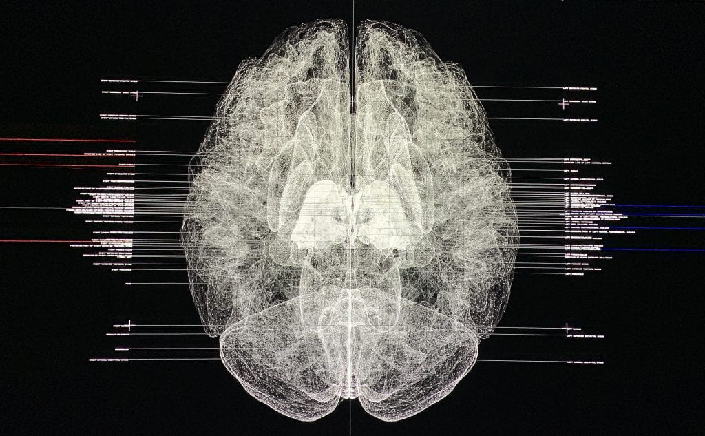
Dataverse (2019)
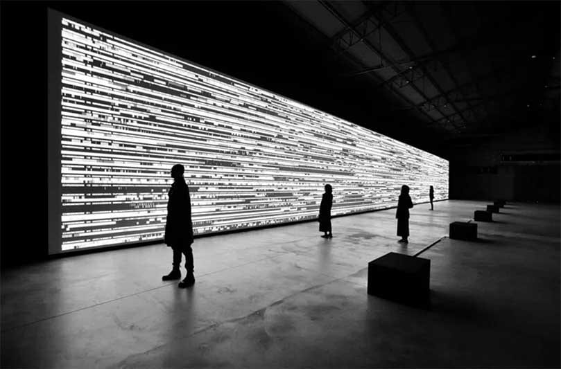
Ikeda’s work in the Giardini was very different from the Dataverse, and not very typical of the artist’s larger body of work. Spectra III was a work originally from 2008, and it was recreated for the Biennale. The work is a corridor of bright fluorescent tubes that immerses its viewers in pure white illumination as they walk through the hallway. It becomes difficult to see anything while walking through this path, and viewers cannot quite comprehend what it is they are experiencing. Ikeda describes the feeling Spectra III gives off as being similar to being in total darkness. The blinding excess of light makes this space feel almost invisible and unable to be perceived. The experience that I had walking through this exhibit was very different from the experience that I had while watching the video piece in the Arsenale. Though they both gave off overwhelming and stimulating effects, these effects were received in very different ways. After walking through the Giardini’s endless maze of gallery spaces filled with showy, attention grabbing exhibits, Spectra III appeared to wipe my artistic palette clean. It felt almost ironic to me that the rooms of artwork felt overwhelming, but Ikeda’s perceptually daunting corridor made me feel at ease. The sensory wipe out that I experienced revived me and gave me more perceptual space to take in more, but at the same time this bright white light was completely immersive and almost blinding as I walked through it.

Spectra III (2019)
When these works are put side by side, it is apparent that Ikeda’s goal was for his pieces to push our senses to our limits. However, the two works are overwhelming and overpowering in different ways. The rapidly flashing pictures and motion graphics in Dataverse is accompanied by rapid beats of extremely high tones that hypnotize the viewers. On the other hand, the complete absence of anything except a bright light seems extremely overwhelming to viewers, but the space is empty and silent at the same time. Both exhibits also made me consider the infinite qualities of the sensory conditions being created. Spectra III felt like it couldn’t possibly get any brighter and still be perceived by the human eye. In the same way, pitches in Dataverse felt like they couldn’t possibly get any higher and still be perceived by the human ear. However, while I felt very in tune with the physicality of my body as I traversed through the Spectra III space, Dataverse felt somewhat removed from my own personal experience. Instead, I felt like I was experiencing the expanse of a universe I wasn’t directly a part of, and the data felt unrelated to my own experience because I was unable to decode it.
Aside from visual installations and video pieces, Ikeda is also an electronic composer and many of his recent projects have been solely focused on music. He has worked with the Vinyl Factory to create several records that are not meant to accompany a visual work. Ikeda often describes his work as exploring “monumental minimalism.” The artist refers to his data, colors, and simple tones as being minimal in nature, but on the other hand, the way in which this information is presented to us is monumental. Though Ikeda’s tones are confined to a high auditory range, they are layered and repeated in overwhelming ways. The sounds themselves are simple, but the rapid repetition of tones and the extremely high frequencies still make the word minimal not quite work. One work that comes closest to achieving that minimalistic goal is the recent traveling work A [continuum], recently exhibited in Centre Pompidou, Paris. In this exhibition, Ikeda set up five identical large-scale speakers around the perimeter of the exhibition space. Each speaker played its own tone, and when the viewer stood in the middle of them, the tones began to blend into their own abstracted harmony. This exhibition presented a purely auditory and sensory experience that none of Ikeda’s other works achieve. However, if these tones are constructed in a way that is so complicated, can there really ever be such thing as monumental minimalism? The moment the work becomes overwhelming and all-encompassing is the moment where minimalism can no longer hold its ground. There is something so inherently complicated with the way we perceive Ikeda’s work that it wouldn’t make sense to call his work minimal.

A [continuum] (2018)

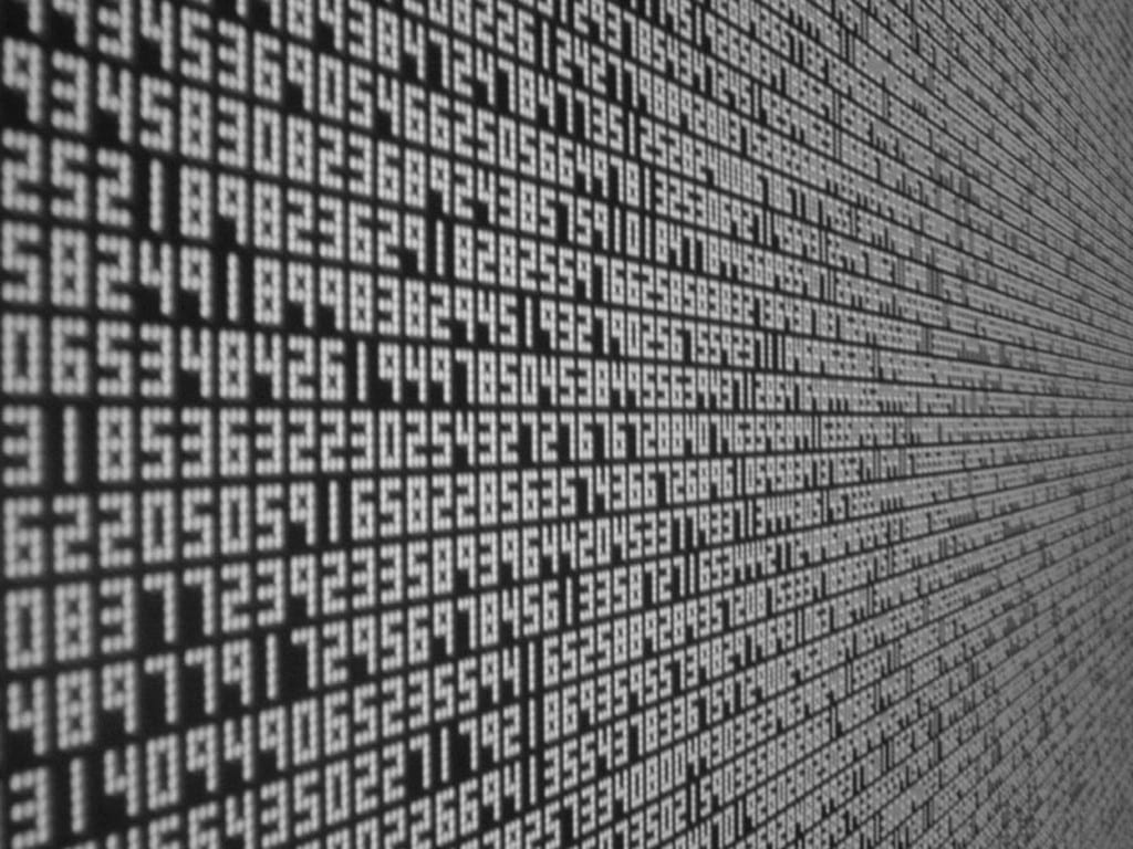
Test Pattern (2008)
The last and most important question that Ikeda’s work confronts is a question of the nature of his data-driven art. In recent years, many faces in the art world have tried to define what makes data driven art, art. An article from News Atlas proposes that “the line between straightforward information conveyance and art is frequently blurred by many artists who create beautiful and compelling forms of data visualization.” An Atlantic article also poses the possibility that data-driven installations are just “powerfully presented data, rather than conceptual art.” This concern stems from the rise in data-driven art in the art market, specifically with artists who track their daily movements, intake, or interactions. The Atlantic article also proposes that idea that “data art may be the apogee of self-expression—a digital fingerprint that says more about modern man, and the inevitable forward march of time, than anything artists have been able to produce before.” However, in the case of Ikeda’s data-driven art, there is not much of a personal feeling associated with it. Viewers are exposed to the limitless expanse of Ikeda’s universe that is grounded in the reality of our world, but the data has been so abstracted and left without description that it becomes hard for us to connect with the content that is left. For example, in Test Pattern, the binary code of black and white is undoubtedly perceptually stimulating and hypnotic, but nothing about the installations presents a legible human fingerprint. In installations like Spectra III, the perceptual stimulation is more related to the physicality of the human being, though it is not driven by data specifically. Nevertheless, when Ikeda does work with data, he makes beautiful and stimulating compilations of visual information. Thus, it seems like Ikeda is either making powerful situations artistically, or presenting data in a beautiful, mesmerizing manner. In this way, he seems to teeter on the thin line between artistic expression and expressionless data presentation. In each different installation, a different view becomes dominant.
Reese Berman