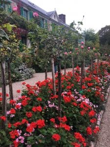
 In the last twenty-five years of his career, the impressionist artist Claude Monet obsessively began and reworked a series of increasingly large paintings of waterlilies. Monet was inspired by the Japanese-style pond and bridge that he’d built at his country house in Giverny starting in 1893. Monet and his family moved to the suburb of Paris along the Seine in the early 1880s, and he quickly began transforming the land surrounding the house into elaborate, carefully curated landscape gardens, including the Japanese pond. Monet, the astute observer and keen replicator of the effects of the natural world, was here transforming and aestheticizing nature itself. In the gardens at Giverny, he created an all-encompassing, artistically-orchestrated environment where he could live and paint.
With the waterlily pictures, Monet began to experiment in the same way with paint. Was it possible to give viewers the experience of immersion when looking at a painting? What would such a painting look like?
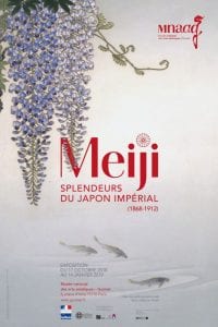
 In these works, Monet unmoors the viewer by discarding traditional features of landscape painting. Instead of receding backgrounds or atmospheric perspective, Monet somehow positions us simultaneously floating above the water and looking at it head on, the glassy surface collapsing with the plane of the canvas itself. Such perspectival play marks the kind of aesthetic affinity between impressionist paintings and ukiyo-e prints. Monet avidly collected and borrowed formal principles from Japanese art. In Naruto Whirlpool, for example, Utagawa Hiroshige presses the horizon line to the top third of the composition, depicting rocks in profile and the eddy from above. The enamel panel used for the promotional materials of the Musée Guimet’s exhibition “Meiji: Splendeurs du Japon Impérial” avoids a horizon line all together. As in the Monet pictures, we look both out and down almost falling into a floating world.

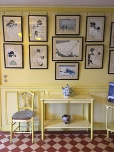
 In actuality, Monet knew very little about Japanese artistic traditions beyond what he could gather from seeing the explosion of objects and prints that made their way to France during the Meiji period. Nonetheless, he clearly admired Japanese prints for their striking formal characteristics and decorative capacities. In his own home, Monet chose to beautify his rooms by completely surrounding himself in hundreds of Japanese prints that he arranged on the walls. The notion of an
  aesthetic space meant to envelope the viewer was in this way tied to Monet’s experiences with decorative Japanese interiors.
By 1915, Monet devised a plan to push the waterlily project to its limits. Under the pretext of a commemoration of World War I, Monet wrote to his friend French Prime Minister Georges Clemenceau proposed gifting the largest of the pictures to the French nation. At first, Monet suggested that the pictures should be housed in the Musée des Arts Décoratifs in Paris, but later he decided that they should be displayed in a stand alone museum where viewers would literally be surrounde d by the massive paintings affixed to the walls. The project, however, took ten years of painstaking back and forth between the artist and the government to reach fruition. Monet was guided by a very particular vision of what he wanted the space to look like. He requested oval rooms of particular dimensions lit by natural lighting so the nature of the pictures would change with the weather and position of the sun. The paintings were to be hung end to end, flush on the curved walls so that they wrapped around spectators in the museum. Architect Louis Bonnier was commissioned to design this museum in 1920, but his design for a one large circular room, rather than oval, was not acceptable to the aging impressionist. Monet thought the room was too regular and risked becoming a “true circus.”
In a final push to realize the project, Monet was offered the Orangerie, a Second Empire building at the edge of the Tuileries gardens that had once housed fruit trees, but was then unoccupied. Monet was satisfied with this choice because it would more closely accommodate his original vision for the space, oval rooms included. The final plans would allow a quasi-processional spectator experience. Viewers enter the museum into a large atrium or antechamber. Before moving into exhibition rooms, they must walk through a small, oval, unadorned chamber that acts as a kind of preparatory space to clear the head and cleanse the eyes of anything that lingers form the streets outside. Once inside the final rooms, viewers find themselves surrounded by Monet’s monumental waterlilies, curving gently with the slope of the walls. Monet described the experience in these words:
“The [device of the Waterlilies] would create the illusion of a whole without end, a wave without horizon and without shore; nerves overwrought by work will be relaxed there, following the example of the stagnant waters… the room will offer the asylum of peaceful  meditation in the center of a flowering aquarium.”
For Monet, the large scale waterlilies and the all-encompassing, immersive environments they created had healing properties. They imbued viewers with calmness and peace. Standing in front of them was a religious, meditative experience, whereby one left the outside world behind and entered into the still, quiet world of gentle ripples and feather-light branches. Perhaps this was why Monet had such a hard time marking these paintings as finished. They stayed in his studio until his death 1926 when they were finally moved to the new museum.
Further reading:
Faizand de Maupeou, Félice. “Du peintre à l’architecte: La mise en exposition des Nymphéas de Monet à l’Orangerie des Tuileries.” In Situ 32 (2017).
Kelly, Simon R. Mary Schafer, Johanna Bernstein. Monet’s Waterlilies: The Agapanthus Triptych. Seattle: University of Washington Press. 2011.
Tucker, Paul Hayes. Monet in the 90s: The Series Paintings. New Haven: Yale University Press,1998.


