Hon’ami Kōetsu 本阿弥光悦 (calligraphy), Tosa Mitsushige 土佐光重 (illustration), Sanjū rokkasen 三十六歌仙 ca.1610

“Hon’ami Kōetsu 本阿弥光悦 (calligraphy), Tosa Mitsushige 土佐光重 (illustration), Sanjū rokkasen 三十六歌仙, c.1610”


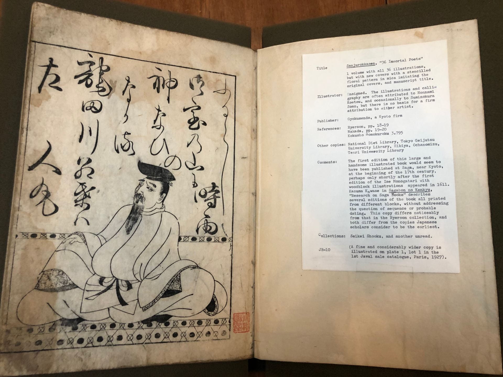
Calligrapher: Hon’ami Kōetsu 本阿弥光悦 (1558-1637)

Original design: attributed to Tosa Mitsushige 土佐光重 (fl. 1390 – 1394)
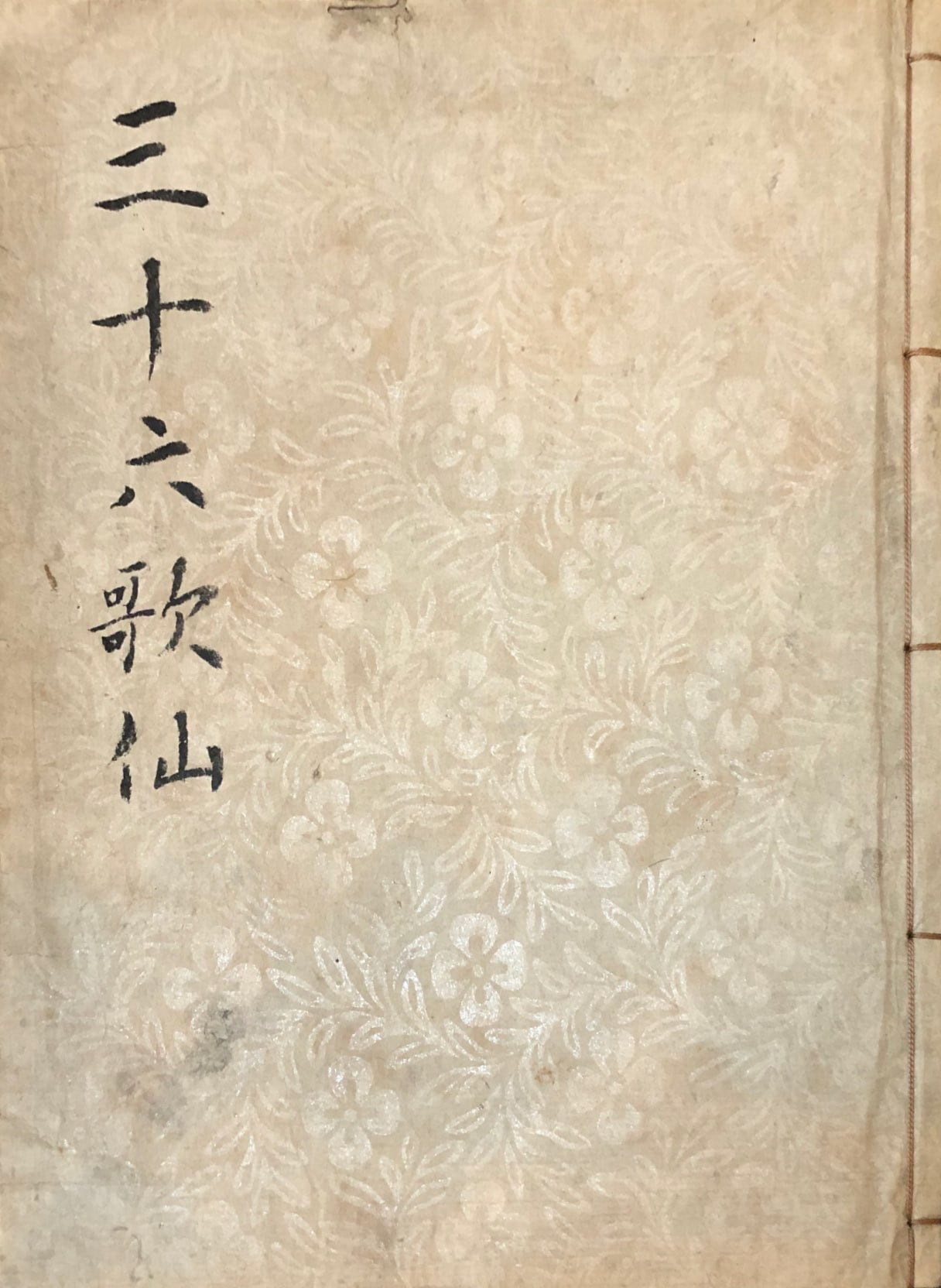
TitleSanjū rokkasen (三十六歌仙)

Date: c.1610

Medium:  Black and white woodblock printed book; ink and color on paper

Dimension: H. 31.5cm x W. 22.8cm

Publisher: Gyokusendō, Kyoto

Gift of Arthur Tress. Box 76, Item 2.

https://franklin.library.upenn.edu/catalog/FRANKLIN_9977502831603681


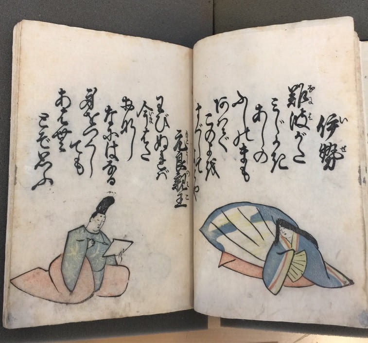
The Sanjū rokkasen (“Thirty-Six Immortal Poets”) is a canonical list of prominent poets of the Asuka, Nara, and Heian Period compiled by Fujiwara no Kinto around the year 1010. These poets include famous names such as Kakinomoto no Hitomaro, Ono no Komachi, Ki no Tsurayuki, Ariwara no Narihira and so on. Kinto selected one exemplary poem from each of the poets and compiled the Sanjū rokkasen. Since then, this important collection has been often the source for Japanese literature and art.

The interest in creating imaginary portraits of the poets began in the late twelfth century. The thirty-six poets would be placed into two teams – the “left” team, consisting of the first eighteen poets, and the “right” team of the later eighteen poets. The portraits of the left team face the right, and the right teams face the left, as if they are looking at their opponents for a poetry competition (utaawase in Japanese). From the thirteenth century on, the format of this imaginary competition became the convention for the portrayal of Kinto’s “Thirty-Six Immortal Poets,” and it is also used in this example from the Tress Collection.

This variation on the Thirty-Six immortal poets was first published in 1610 as a commission by Suminokura Soan (1571-1632,) a wealthy merchant in Saga, a village close to Kyoto. Soan collaborated with Hon’ami Kōetsu, who contributed his fine calligraphy for the book. The original design of the illustration imitates paintings by Tosa Mitsushige from the fourteenth century. Each figure is depicted at different ages and with characteristic gestures that reflect their biographical information and anecdotes found in historical references.

The copy in the Tress Collection may be a private re-cut of the original print. Compared to other versions held in the British Museum, the Pulverer Collection, and the Harvard Collection, the Tress copy has some distinctive features that suggest it has been printed from a different set of blocks. Some notable evidence include that 1) the figures in the Tress copy overlap with the foreground decoration while the figures in the other collections are set further back in space; 2) the details in the Tress copy illustrations (e.g., patterns on the garments, hair and so on) differs slightly from that in the other collections; 3) there is a printed stamp of “玉泉堂藏刻 (literally means ‘Gyokusendō Storage Cut’)” on the last page of the Tress copy, which is not found in any other copies. The exact date of this copy is unknown, and the intention of this re-cut is yet to be assessed.


Below is a poem by Kakinomoto no Hitomaro (662-710) (page 1.)

Honobono to

Akashi no ura no

Asagiri ni

Shimagakureyuku

Fune o shi zo mou


Faintly with the dawn

That glimmers on Akashi Bay

In the morning mist

A boat goes hidden by the isle –

And my thoughts go after it4


Other copies of this book series:

Freer Gallery of Art, Washington DC

Harvard University, Arthur M. Sackler Museum

New York Public Library, New York City

The Gerhard Pulverer Collection

The British Museum


Selected Readings:


Posted by Yuqi Zhao

February 19th, 2020

Katsuma Ryūsui 勝間竜水, Umi no sachi 海幸, 1762

Artist: Katsuma Ryūsui 勝間竜水 (1711-1796)

Title: Umi no sachi 海幸

Date: 1762

Medium: Woodblock printed, ink and color on paper

Gift of Arthur Tress, Arthur Tress Collection of Japanese Illustrated Books, Ryūsui 1

Umi no sachi, or Treasures of the Sea, is an extraordinary two-volume book of poetry matched with lavish color-printed illustrations of fish. Produced in large format on an unusual theme, this project was probably the private production of a poetry circle, rather than a commercial publication.(1) At its core, the work is a compilation of haikai poems. Yet its unusual theme, exceptional printing, and fascinating, deftly executed pictures defy such easy classification.

The first volume opens with a preface by the esteemed Baba Songi (1703–1782), a leading practitioner of haikai poetry in the mid-eighteenth century. Next come three further introductory texts: one by the book’s editor and fellow poet Sekijukan Shūkoku and two by artist Katsuma Ryūsui. Shūkoku’s preface outlines the allusion present in Umi no sachi’s title: the ancient tale of two brothers, Umi no Sachi Hiko (Prince Luck of the Sea) and Yama no Sachi Hiko (Prince Luck of the Mountain), found in the early chronicle the Kojiki (A Record of Ancient Matters, 712).(2) It was typical in the period for such prefaces to provide highly elevated or literary references, such as this classical text, no matter how mundane the content. In this case, it provides the justification for the aquatic theme to follow.

In the main text of the book, each page opening reveals new variety of fish, splendidly printed in color and accompanied by poems for each type. With more than one hundred species represented, the book presents a veritable catalogue of the bounty of the sea, rivers, and lakes. These aquatic creatures range from established delicacies like sea bream, tuna, octopus, eel, and various kinds of shrimp to more exotic subjects like the whale—so vast it is represented by the inky darkness of a page printed in reverse—and the semi-mythical minogame—a hairy-backed turtle and symbol of longevity. Every illustrated fish is also identified by name, sometimes with several Chinese variations, as if to imitate the conventions of natural history texts.

One of the things that makes Umi no sachi so significant in the history of Japanese print culture is that its abundant color printing predates the development of full-color nishiki-e in sheet prints by three years. Every illustration uses at least two printed colors in addition to black; most illustrations display up to five or even six colors. And though profuse and elaborate, the color printing in this book is often quite subtle. A fish might be depicted in three shades of grey, rather than boldly saturated with contrasting colors. Furthermore, each fish, mollusk, or crustacean is approached with a degree of naturalism by artist Ryūsui. Their sometimes startling morphological verisimilitude signals the growing interest in the period in honzōgaku, or natural studies.

Highly appreciated in the period, Umi no sachi was reprinted multiple times by successive publishers. The Tress copy of Umi no sachi comes from the first printing, published by Kameya Tahei in the second month of 1762. These early printings rank among the very finest examples of early multiple color woodblock printing in Japan, enhanced with special techniques like applications of mica which make the fish seem to shimmer on the page.

(1) Their poems and sobriquets appear throughout the book, and though most of these poets are unknown today, it has been speculated that some of the contributors may have been high-ranking samurai See Kira Sueo, “Tashokuzuri ebaisho ni tsuite,” 16.
(2) Both the Kojiki and Nihon shoki contain versions of this story. For an English translation of the story based on the Kojiki, see Ō and Heldt, The Kojiki, 53-60.

Other collections:
Pulverer Collection, Freer Gallery of Art

Posted by Jeannie Kenmotsu, April 6, 2022

Katsushika Hokusai 葛飾北斎, Kyōka kunizukushi 狂歌国尽, ca. 1810

Artists: Katsushika Hokusai 葛飾北斎 (1760-1849), Katsushika Ōi (ca. 1800-ca.1870) and others

Editor: Hasendō Yoboke 巴扇堂暮気 (?-1820)

Title: Kyōka kunizukushi 狂歌国尽 ‘Mad Verse’ of Selected Provinces

Date: ca. 1810

Medium: Woodblock printed, ink on paper

Gift of Arthur Tress, Arthur Tress Collection of Japanese Illustrated Books, Hokusai 43

Katsushika Ōi (応為) was one of the rare women artists to forge a career in Edo-period Japan. Like other women artists at the time, she was able to do so due to her family connections; in her case, she could work as a professional illustrator and painter because she was one of Hokusai’s daughters. She was trained in her father’s studio, often assisting in preparing materials and learning to draw alongside his other students. This book includes her first printed illustration, a scene of sailboats in the mist, and is signed “from the brush of the woman Ei” (using her personal name, Ei) on the right opening. She was likely only about ten years old at the time this was published.

This book is an anthology of poetry, edited by Hasendō Yoboke, with an opening illustration by Hokusai followed by those by fifteen of his students; Ōi is included in this grouping as equal to all. The poems that appear in each double-page opening were submitted and ranked by a group of leading poets; the judges’ ratings appear as a list of numbers between the poet’s name and the poem itself.

The concept of the anthology seems to have been for each poet to write a poem related to one of the provinces (called kuni in the period). Here, the poet Utanoya Mahagi (歌廼屋真萩) writes about the province of Enshū (now Shizuoka) and its famous site, Hamamatsu, located along the coastline and with rising mountains beyond. Hamamatsu was one of the fifty-three stations of the Tōkaidō road linking Edo to Kyoto; its name referred to the pine trees (matsu) that grew in the sand by the bay (hama). Period imagery often shows the motif of pines grown in sand and with the sea beyond to mark this famous place.

The poem starts on the upper right and proceeds to the left, then breaks to begin again in the lower register, from right to left. It puns on Enshū (as a distance province) as well as on Hamamatsu’s piney shore:

夏草のしけるる / 遠州 / はま松は
ひろい / やう / ても / せまい / 道野 /邉

And can be translated as:

Hamamatsu, in the distant province of Enshū,
grows thick with summer grasses and
with its pines on the shore
seem so vast yet
the road and fields so narrow

In this period poetry always included references to the season, as here in the summer grasses. The poet also plays with contrasts in the wide open space of the sea and the narrowness of road and fields skirting the terrain between dunes and mountains.

Ōi married one of Hokusai’s other students, Minamizawa Tōmei, in about 1824, but by 1827 she separated from her husband and returned to live with Hokusai, working alongside her father until his death in 1849. She assisted him with his many commissions during this period, perhaps even contributing to some of his most famous paintings, prints and illustrated books. After her father’s death, she worked as an independent artist until about 1870, making paintings and designing two illustrated books under her own signature.

Other collections:
British Museum

Selected reading:

John T. Carpenter, “The Literary Network: Private Commissions for Hokusai and His Circle,” in Designed for Pleasure: The World of Edo Japan in Prints and Paintings, 1680-1860, ed. by Julia Meech and Jane Oliver (New York, 2008), 143-68.

Julie Nelson Davis, “Hokusai and Ōi: Art runs in the Family,” British Museum blog (2017): https://blog.britishmuseum.org/hokusai-and-oi-keeping-it-in-the-family/

Kobayashi Tadashi, “The Floating World in light and shadow — Ukiyo-e paintings by Hokusai’s daughter Ōi,” Hokusai and his Age: Ukiyo-e Painting, Printmaking and Book Illustration in Late Edo Japan, translated and adapted by Julie Nelson Davis, edited by John T. Carpenter (Leiden, 2005), 92-103.

Kubota Kazuhiro. Hokusai musume, Ōi Eijo shū (Tokyo, 2015).

Posted by Julie Nelson Davis, March 14, 2022

Kitao Masayoshi 北尾政美, Hyakunin isshu / 百人一首

Poem on right, as translated by the University of Virginia:
Lady Ise
Even for a time
Short as a piece of the reeds
In Naniwa’s marsh,We must never meet again:
Is this what you are asking me?


Artist: Kitao Masayoshi (Japanese, 1764–1824) (later adopted the name Kuwagata Keisai)

TitleHyakunin isshu

Date: Unknown, originally published ca. 1815

Medium: Woodblock print, 22.3 cm x 14.5 cm

Gift of Arthur Tress, Box 10, Item 16

Hyakunin isshu is based upon the classical poetry compilation Hyakunin isshu, or One hundred people, one poem (each), selected by Fujiwara no Teika in the twelfth century. This original compilation comprises of one hundred courtly poems spanning from the seventh century to Teika’s time, written in the style of the Japanese tanka, or waka, an early poetic form meaning “Japanese poetry” as opposed to Japanese poetry written in the Chinese language. In this way Hyakunin isshu represents the impulse to forge a distinctively Japanese poetic identity, separating courtly poems from their occasions to combine them into the singular aestheticized project we know today. From its conception in pre-modern Japan, Hyakunin isshu has since transformed from a material artifact into a historicized text that is reinterpreted and decontextualized time and again, much in the same manner of classical Western texts such as The Iliad and The Odyssey. Since the fifteenth century there are records of commentaries published alongside Hyakunin isshu, and, by Masayoshi’s time, Hyakunin Isshu had gained such accessibility and widespread appeal that it prompted almost every major ukiyo-e artist to try a hand at illustrating the poems, inspired the playing cards uta-garuta, and effectively blurred the line between “high” and “low” culture.

Kitao Masayoshi’s Hyakunin isshu stands out in two ways. First, in other impressions, the title includes the word tenarai (手習), which translates to practicing writing with a brush. The impression in the British Museum contains illustrations only, so that readers may take up the brush and add the poems themselves. Second, Masayoshi’s style is curiously simple: the spread of colors, marked by hard outlines, affirms its own stripped-down beauty. A pupil of Shigemasa, Masayoshi experimented with various styles throughout his lifetime, from a typical ukiyo-e style to an adaptation of the Chinese technique. As for Hyakunin isshu, Masayoshi chose a symbolic, representational style that stands directly in contrast to the highly realistic style of Western art at a time, evoking the heart of an abstract, classical time with a language of his own.

There are currently few known copies of Masayoshi’s Hykaunin Isshu. One is an unwritten version in the British Museum; another is a copy with handwritten poems up to the twenty-eighth page, formerly in the Odin collection. According to the NIJL catalogue, two additional copies are held in the Gifu Municipal Library; one of these is digitized and does not include writing. The other is listed as part of Nakano Mitsutoshi’s collection. Our copy is rare among known copies in that all the poems have been added in print. An elegant landscape illustration is furthermore found on the first page, unseen in the British Museum version, and the year of publication is unknown, making it a unique and much mysterious case.

Selected Readings

David Chibbett, The History of Japanese Printing and Book Illustration (New York: Kodansha International Ltd., 1977)

Earl Miner, An Introduction to Japanese Court Poetry (Stanford: Stanford University Press, 1968).

Jack Hillier, The Art of the Japanese Book (London: Philip Wilson Publishers Ltd., 1987).

Joshua S. Mostow, Pictures of the Heart: The Hyakunin Isshu in Word and Image (Honolulu: University of Hawai’i, 1996).

Posted by Kelly Liu, Fall semester, 2019

Mishima Yonosuke and Arai Shujiro, Japanische Dichtungen, Weissaster, 1894

Artists: Mishima Yonosuke, Arai Shujiro

Title: Japanische Dichtungen, Weissaster: Ein romantisches Epos nebst anderen Gedichten

Date: 1894

Medium: Woodblock print on crepe paper

Publisher: Takejiro Hasegawa

Gift of Arthur Tress, Arthur Tress Collection Box 39 Item 6 (https://franklin.library.upenn.edu/catalog/FRANKLIN_9977502718403681)


After an introductory text from the translator Karl Florenz, this book includes a German language translation of Kōjo Shiragiku no Uta, a Japanese epic poem published in 1889 by the author Ochiai Naobumi. Naobumi’s epic tells the tale of the titular Weissaster (White Aster), a young girl from a remote village who sets off on a quest to find her father after he fails to return from a hunting expedition. Following the seventy-two-page epic poem, eight shorter poems are included. The entire book is lavishly illustrated with multi-color woodblock prints by Japanese artists. Mishima Yonosuke illustrated most of the book, including the tale of Weissaster, while Arai Shujiro provided illustrations for the poems. Perhaps the most curious feature of the book is its paper. The book is printed on crepe paper, a wrinkly and seemingly dainty variety that became especially popular in the Meiji Period. Crepe paper was formed by inserting paper into molds after printing and illustration was complete, both reducing size and, surprisingly, increasing durability of the book.

Japanische Dichtungen is the result of a collaborative effort between two countries, two continents, and two publishers: printing, illustration, and paper were provided by the publishing firm of Takejiro Hasegawa in Tokyo, while C.F. Amelang Verlag in Leipzig ostensibly provided financial capital as well as arranging translation by Florenz. While the illustrators Yonosuke and Shujiro remain enigmatic, Hasegawa and Florenz are well-known as antiquarians and publishers in the Meiji Period. Takejiro Hasegawa extensively published English, French, and German language translations of popular Japanese folk tales that satisfied Western desires for Japanese literature while providing students in the modernizing Japan with abundant material for learning western languages. The translator, Karl Florenz, was a pioneer of German-language Japanology for his publication and translation of Japanese literature, becoming the first professor of Japanology in Germany at The University of Hamburg.

Other copies of this book are at the German National Library (Deutsche Nationalbibliothek) and the Library of the University of Regensburg (Universitätsbibliothek Regensburg)

Selected Reading

Guth, Christine M. E. “Hasegawa’s Fairy Tales: Toying with Japan.” RES: Anthropology and Aesthetics, no. 53/54 (2008): 266-81.

Hayashida, Yukari. “Wrinkles in Time: Crepe-Paper Books in Watson Library | The Metropolitan Museum of Art.” Accessed March 21, 2020. https://www.metmuseum.org/blogs/in-circulation/2016/crepe-paper.


Sharf, Frederic A. “Selected Bibliography of the Publications of Takejiro Hasegawa.” Peabody Essex Museum Collections 130, no. 4 (Oct 01, 1994).


Posted by Nick Purgett

May 10th, 2020

Takashima Chiharu 高島千春 and Totoya Hokkei 魚屋北渓, Tokiwa no taki 得吉方廼滝, 1833

Artist: Takashima Chiharu 高島千春 and Totoya Hokkei 魚屋北渓

Title: Tokiwa no taki 得吉方廼滝

Date: 1833 (Tenpō 4)

Medium: Woodblock printed ōbon

Measurements: 17.4 x 25.2 cm

Publisher: not specified

Arthur Tress Collection of Japanese Illustrated Books. Box 17, Item 4:

https://franklin.library.upenn.edu/catalog/FRANKLIN_9977502563303681


Dated to 1833 in its preface, Tokiwa no taki (The Everlasting Waterfalls of Tokiwa) was a sequel to Mitsu no tomo-e  from the previous year. This kyōka poetry book contains New Year’s mitsumono (three-link verse) by the Yomo poetry group. Two artists each contributed one illustration to the volume; Chiharu designed a scene of “Springtime at the Waterfall Pavilion” and Hokkei furnished a bucolic view of “Autumn Leaves at Takinogawa.”

Hokkei’s composition is especially dynamic. A family journeys across a narrow bridge spanning a richly cerulean river rippled with silver. The man waves a puppet playfully to distract the young child carried on his mother’s back. On shore, two men admire foliage of a nearby tree. An ombré of gold bands the sky, capping the autumnal landscape and underscoring the care and expense of the book’s manufacture.

The seasonal imagery resonates with the accompanying poems, which also take on themes of flowers and autumn leaves. Four openings at the beginning of the book list the poetry submissions across blue and white rectangular forms, evocative of tanzaku (hanging poetry slips), which are further accented with cherry blossom and maple branches. The original light blue cover exhibits aqueous motifs including a dark blue wave.

Totoya Hokkei (1780—1850) was a student of Hokusai, and a prominent and prolific contributor to ukiyo-e in his own right. Born in Edo, Hokkei’s oeuvre encompasses a variety of works, including book illustration, brocade prints, erotica, and private commission surimono. In addition to their work for Tokiwa no taki, both Takashima Chiharu (1777-1859)  and Hokkei designed prints for Mitsu no tomo-e (the series’ first installment)utilizing a similar color palate and high quality of execution.

Other copies:

The Pulverer Collection, Freer Gallery of Art and the Arthur M. Sackler Gallery, Washington, D.C.

The Museum of Fine Arts, Boston,The Harvard Art Museums and the Art Institute of Chicago, include Hokkei’s illustration as a single print.

Selected reading:

Jack Hillier, The Art of the Japanese Book, 2 vols. (London: Sotheby’s Publications, 1987), vol. 2, 836–7.

Suzuki Jun, commentary, Tokiwa no takihttp://pulverer.si.edu/node/434/title/1 (accessed November 12, 2019)


Submitted by Zoe Coyle, November 14, 2019